Finding Inspiration as a Floral Designer: Learning about Color from the Great Artists

Hey, floral pro: Do you consider yourself an artist?
All creatives are inspired by something. Inspiration is an integral part of the design process. As a floral designer, what inspires you to create? What sparks joy and awe? What stimulates a new blend of colors in your design?
Maybe you’re inspired by a story, a person's life, other floral designs, or the natural world.
But what about other forms of art? Can a painting inspire a floral designer? What about a sculpture or piece of architectural beauty?
Throughout time, art has captured beauty through arrangement, movement, color, and texture. In this same way, floral design takes a natural piece of the world and transforms it into a new kind of beauty through arrangement, movement, color, and texture.
Through many generations, artists have studied, examined, and practiced color theory. One of the mediums that can spark creativity with color can be art history. As floral designers, we work with flowers. Although a different medium, we can look to the mix of hues in Monet's classic Impressionist work, a landscape by J.M.W. Turner, or maybe even the Italian Renaissance masterpieces for creativity.
This article will focus on color inspiration through the lens of paintings. Floral designers will see how to notice the color used in paintings, transfer that to design, and, finally, implement practical steps of prioritizing inspiration in the creative process.
Noticing Color Theory in Other Art Forms
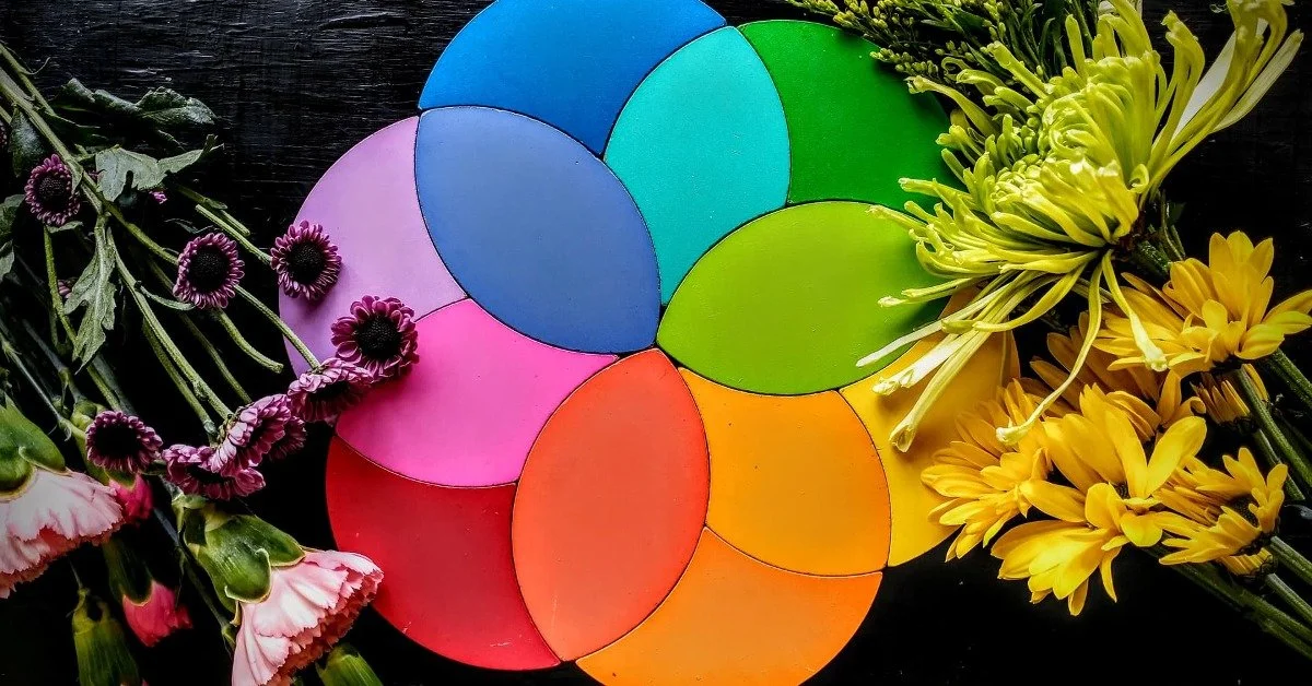
One of the important aspects of design is color. Color is a fascinating aspect of our world. Color can change the feeling of a subject. The relationship and interaction between colors can dramatically affect what the eye sees.
Color theory is the understanding of color and the relationship between colors. The foundation of color theory is based on the primary colors blue, yellow, and red.
“The relationship and interaction between colors can dramatically affect what the eye sees.”
Color theory expands from these three primary colors into a host of relationships between colors, including secondary, tertiary, complementary, analogue, warm, and cool colors. Warm colors include hues of red, orange, and yellow; cool colors are hues of green, blue, and violet.
Colors also vary in value according to grayscale, from vivid bolds to soft pastels. Like a bouquet, a collection of different colored flowers and intensities create limitless combinations.
Understanding the terminology and usage of color can be helpful in knowing how to utilize color in design to enthrall viewers correctly.
To understand how color works, it’s helpful to see color visually displayed. Paintings are one way to see the work of color theory clearly arranged.

Learn from the Greats
The Impressionists and Post-Impressionists explored color instead of focusing on realism, such as their predecessors did. This focus on an exploration of color can be a very helpful display for other creatives.
The Impressionist artists started to play around with larger brush strokes, an avant-garde idea at the time. These larger brush strokes reveal the many tones used to create color.
For example, you may see a painting with a lovely blue color, but at a closer look, there is also an orange color existing against and amidst the blue. These oranges bring out a more real blue tone and vice versa.
Monet, one of the master Impressionist artists, painted scenes often focusing on color, both analogue and complimentary. His famous studies of water lilies represent analogous colors, those who are close to each other on the color wheel.
For example, Monet's painting The Water Lilies - The Clouds focuses on blue, green, and purple tones to create a soothing and relaxing scene. Those hues of blue, green, and purple can be pulled out to design a beautiful floral arrangement, also evoking a sense of calm.
“A focus on an exploration of color can be a very helpful display for other creatives.”
Another example of Monet's use of analogue colors is his painting Waterloo Bridge. After observing this impressionistic scene of a bridge, I was inspired by how many hues are used together.
I love the way Monet made the lavender purple stand out the most among the other colors. The purple tones are found among varying hues of blue and green. Upon closer review, I found the painting slightly tinged with white, orange, and pink. These colors—especially the white, orange, and pink—are ever so slight as to draw the eye to the lavender purple. The analogue colors of blue and green hues also add to the lavender purple, making a peaceful array of colors.
J.M.W. Turner, although a painter of an earlier Romantic period, has landscapes that also provide an appealing representation of hues. Turner's A Disaster at Sea is full of warm golden tones. At first glance, the painting looks like an impressionistic scene of a shipwreck.
However, when viewed more intentionally, the painting's subject fades into the background, and Turner's use of color becomes most prominent. As one looks at the image, it appears that gold is the focal color of the painting. Turner uses a subtle complementary color pairing of blue to contrast the yellow and gold.
At a closer look, the light blue and grey colors sink into the background, and the gold pushes forward. There are hues of white and almost a faint hint of red surrounding the focal point of gold. Overall this warm-toned painting gives heir to a hue of colors that complement each other and bring forth the truest sense of yellow and gold to grab the viewer's attention.
The Impressionist and Romantic artists are not the only ones to inspire a new lens on color theory. If looking for inspiration for a more bold design with red, the Italian Renaissance masterpieces are a place to look. These artists were experts at using light to accentuate the striking primary colors.

Inspiration to Design
As you examine art, start to notice how specific colors look when paired with others. How does blue appear when paired with its contrasting color of orange, or maybe an analogue color of purple? Take notice of the feeling a color combination gives.
Here are some questions to ask yourself when spending time reviewing art:
What colors are used?
What colors stand out?
What colors recede into the background?
What colors are complimentary?
What feelings do the colors give?
Save the idea! Write down the piece of art that inspires you. Save the color combination that sparked a design.
Can you take those colors and create a floral arrangement using the same combination of colors and tones? Perhaps a client has a favorite artist or painting that can spark a design for their wedding?
“Can you take those colors and create a floral arrangement using the same combination of colors and tones? ”
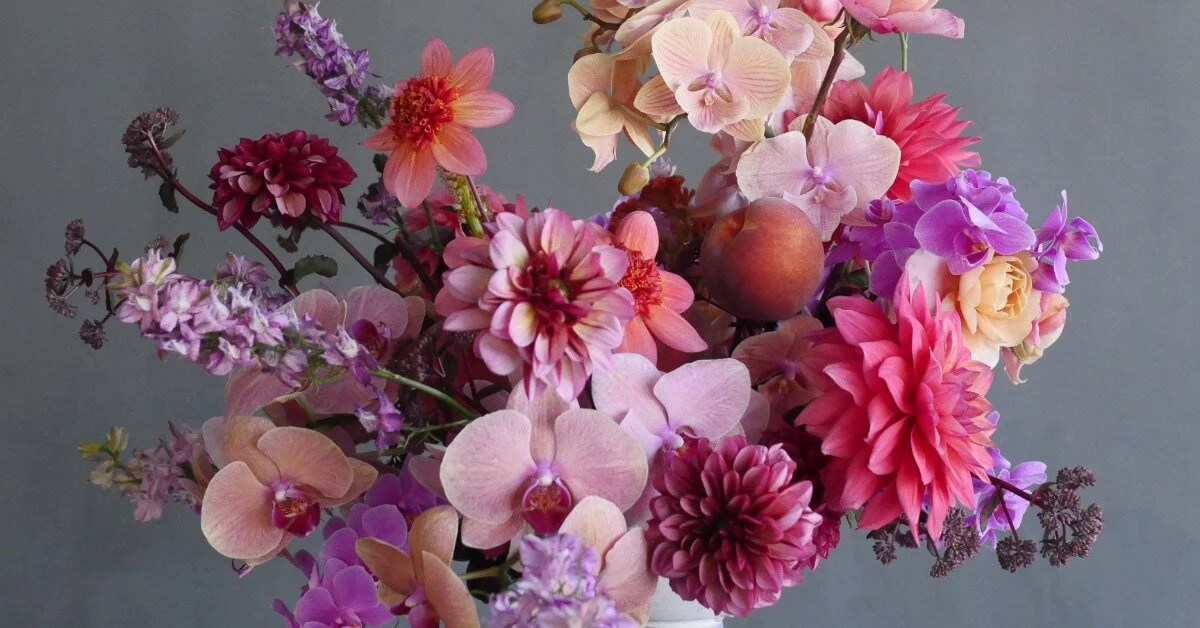
Inspired by the lavender focal points with secondary tones of blue, green, and hints of white, orange, and pink of Monet's Waterloo Bridge, I wanted to make an arrangement that used the same colors to evoke the same impression.
Monet explored the use of color with paint. Although flowers are a different medium, I can, in the same way, create tones of Monet's piece. If it weren't for the painting, I might not have initially thought about a hint of orange or pink to bring out the lavender and blue tones.

It's Okay to Copy
The great artists of history studied, examined, and practiced art. There are centuries upon centuries of art available at our fingertips, now more than ever. Especially when it comes to color theory—utilize the artists of old as your teachers.
"What a good artist understands is that nothing comes from nowhere. All creative work builds on what came before. Nothing is completely original." (Kleon, 7).
The Practice of Finding Inspiration
Now back to the first question: Do you consider yourself an artist? If so, prioritize your time for inspiration. Study and observe color and the way it works in different ways.
Life is busy, so schedule in time to simply be inspired! So then, what inspires you?
Maybe give art history a try. Are you inspired by a certain type, medium, or time period? Maybe going to an art museum doesn't spark much creativity. That's okay! Art is found in other places. Explore a new area. Walk around a city and be inspired by the architecture you see and notice the color of exterior or interior design.
Maybe you need inspiration for something beyond color. Art can inspire so many other things, including arrangement, movement, and texture.
Maybe the natural world sparks new creativity. Spend intentional time outside observing the beauty of the world around you.
"Your job is to collect good ideas. The more good ideas you collect, the more you choose from to be influenced by." (Kleon, 14).
Don't be afraid to look through the lens of other artists. You never know what new idea may spark a beautiful piece of floral design.
Sources
Kleon, Austin. Steal Like an Artist: 10 Things Nobody Told You About Being Creative. New York, Workman Publishing Company, 2012.
Monet, Claude. The Water Lilies - The Clouds. 1915-1926. Musée de L'Orangerie, Paris. Google Arts and Culture, https://artsandculture.google.com/asset/the-water-lilies-the-clouds/YQEt9_UVgiL-Og.
Monet, Claude. The Waterloo Bridge, 1903. Denver Art Museum, Denver. Google Arts and Culture, https://artsandculture.google.com/asset/waterloo-bridge-claude-monet/pAGQ8rtR9PbpJw.
Turner, J.M.W. A Disaster at Sea. 1835. Tate Britain, London. Google Arts and Culture, https://artsandculture.google.com/asset/a-disaster-at-sea-joseph-mallord-william-turner/uQFUIEJ0ZTnAIQ?hl=en.
Photography: Sarah Jane Field