Impressionist Inspiration for Floral Arrangements of Color

What stands out to you most when you find or create a floral arrangement that you love? What’s that "wow factor” in an arrangement that you keep looking back to?
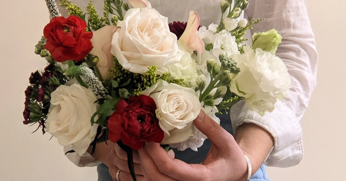
Is it the use of color in the composition of the arrangement? Most of the time. that’s what it is for me! It is not just one color that is striking to me, but how all of the colors work together.
The more I studied art, the more I realized that the greatest artists did not merely splatter paint on the canvas hoping for something to work out.
No—the color used was purposeful, purposeful in a way to complete an entire picture. Colors are used to enhance and work with one another.
Floral design works in the same manner. The flowers chosen for an arrangement are made up of a mix of individual colors. However, the orientation and placement of all of those colors in an arrangement work as a whole. Together they create one piece.
With the colors visually displayed, paintings are excellent teachers for those designing with flowers. Paintings show what colors look like when paired with another. In my previous Team Flower article, I began to look at how art history can be such a helpful tool for inspiration.
Now let's dive deeper and examine more fine-art pieces for their use of color design!
Renoir
There are so many great artists I could choose to look at. The Baroque artists were masters of the use of bold and striking primary colors. The fantastical Rococo style can inspire any lush and light-hearted floral design. The Romanticism movement brought sweeping landscapes and peaceful natural and organic earth tones. However, it is largely the Impressionists artists that capture my attention when it comes to color.
Pierre-Auguste Renoir (1841–1919) is one such Impressionist artist.

Renoir, Pierre-Auguste. Dance at Le Moulin de la Galette, 1876.
Light and Color
What stands out to you in Dance at Le Moulin de la Galette by Renoir?
For me, it is the way Renoir infuses light into this scene. As the viewer, you can almost feel the light shining through the trees. Even though most of the figures are dressed in darker clothing, the painting still evokes a light air. Amidst the darker clothing and shade provided by trees, the pastel pinks and blues still stand out.
The Impressionist painters were masters of infusing light into their paintings, and Renoir exemplifies this so well. Renoir dots the piece with white and yellow creating a bright scene that illuminates the pastel colors.
My eye lands on the ladies in the foreground and the woman dancing dressed in light pink. The woman in the foreground is wearing a striped dress made up of the same blush pink as the dancing woman. These blush pink tones, contrasting to the other figures' darker clothing, aid in creating this light scene.
The sun, appearing to poke through the trees, is shining on her more than the rest of the figures in the painting. In a busy arrangement, the eye can easily get overwhelmed with too many colors vying for your attention. However, a break in the arrangement created by contrasting tones can give a place for the eye to rest. The light pouring in through the trees on the woman dancing does just this.
This same technique can also be applied to floral design. Creating pockets of contrast in your design can transform what your viewers see. If Renoir's painting did not have these lighter focal points, this pleasing scene of an outdoor party might actually come across as hectic and crowded with colors.
Is there a certain color or floral bloom that you want the eye to draw to in your design? What other colors can you bring into the arrangement so that the eye is drawn to that bloom?

Renoir, Pierre-Auguste. Luncheon of the Boating Party, 1880-1881.
Balance of Colors
The deep reds in Renoir's summer-like scene of Luncheon of the Boating Party by Renior draw me in.
The white of the shirts and tablecloth and the yellow of the hats are the lighter colors that dominate the painting. The light red awning, hints of lavender, and the glimpse of the water scene behind also add to the light colors of the painting.
However, Renoir has included a few darker hues of red, blue, green, and brown. Although deeper and stronger shades are present, they do not take away from the light colors. I love the way that deep red looks when used alongside pastel colors to give that summer-like feeling.
Renoir is displaying the power of pairing colors. Do not be afraid to add darker hues into an arrangement dominated by lighter tones. When used correctly, the darker hues can, in fact, enhance the light.
The Use of Blue
I've always been enchanted by the color blue, which means I also love when a floral design has hints of blue tones. To create a captivating design using blue, the arrangement does not need to be dominated by blue but simply contrasted with colors that display the blue in its truest form.
Renoir's Oarsmen at Chatou (1879) displays the color blue in this way. Blue is not the dominant color present in the painting. The scene strongly utilizes the striking color of orange to contrast the blue. The use of orange makes the water a more real blue color to our eyes.
Another painting in which Renoir displays blue tones is St. Tropez (1902). Renoir uses blue, typically considered a cool color, in a warm-toned painting. The blue of the water is paired with warm tones of white, purple, yellow, and brown. This serene scene transforms the feeling of the blue color uniquely by the pairing of other tones.
Although the hints of blue are subtle, the cool color of blue does not distract from the warm-toned painting. I can imagine a floral arrangement of cream, yellow, lavender, and hints of blue flowers creating the same feeling St. Tropez evokes.


In Closing
The Impressionists' paintings are not the only fine art to draw on for inspiration. Whatever medium, period, or artist you are enthralled by, I encourage you to sit in front of that piece for a while.
What feelings do the colors give? What color pairings stand out to you? How does the pairing of those colors together transform the overall piece? How then can you transfer the same color palette to a floral design?
Fine art creates an ideal lens into which a florist can examine how to best utilize colors in floral design.
Art Works Cited:
Renoir, Pierre-Auguste. Dance at Le Moulin de la Galette, 1876. Musée d’Orsay, Paris. Google Arts and Culture.
Renoir, Pierre-Auguste. Luncheon of the Boating Party, 1880-1881. The Phillips Collection, Washington D.C. Google Arts and Culture.
Renoir, Pierre-Auguste. Oarsmen at Chatou, 1879. National Gallery of Art, Washington D.C. Google Arts and Culture.
Renoir, Pierre-Auguste. St. Tropez, 1902. Birmingham Museum and Art Gallery, Birmingham, United Kingdom.