How to move your clients beyond basic color palettes
Blush and gold. Pink and white. Green and white. Snooze!
We’ve all been there — the clients who seem to want the same thing that every other bride has ever had (thanks, Pinterest). This past season, I swear that about 40% of my weddings were blush and white, and 40% of my weddings were white and green. I have always been attracted to great color palettes, but I know that using a lot of color is scary for a bride. I’ve never really known how to navigate the conversation of, “so, your color palette is super boring and just like every other wedding I do. Can we do something more interesting?”

This year, I made it one of my goals to spend a little bit of time each week taking styled photos of flower petals and bits (a la Bows & Arrows Flowers), with the thought that it would be great Instagram content. But then I realized, I could use this to create a visual for brides who are stuck in those boring color palettes and are anxious about adding in more color!
To be honest, I didn’t think it would work. I thought I would get all flustered in a consultation, trying to show brides some photos I took on my studio floor, and nervously try to avoid hurting their feelings. But… it worked! And it worked from the first time I tried it!
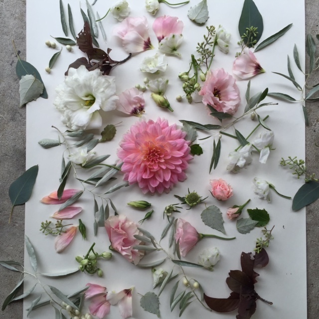
I start by taking photos first of a boring color palette, say, basic green and white. I then slowly layer in petals and bits in interesting tones and textures, one color step at a time. In this case, I started with a burgundy leaf and berry. The next step was a soft pink (bonus points for using pink lisianthus that had a burgundy center!). One step further, I added a hint of soft, creamy yellow.
I now had four photos to show my bride, starting with her base color palette and showing her how we can use a touch of other tones to add interest, dimension, and movement to her bouquets, without it being an overwhelming amount of color. The first bride I showed this to LOVED it. She felt like the touch of burgundy was the perfect accent. I reassured her that just because that tone was in her flowers didn’t mean that burgundy had to become one of her main colors, but instead, showed her that the color brought more life to her flowers!
I tried this with a fall palette, as well (it’s one of my goals to say “so long!” to boring fall color palettes).
- Plain old plum
- Touches of bright chartreuse foliage
- Layers of rusty red foliage
- Bold hits of coppery/orange mums (I especially think that having a visual representation of something bold and bright like this is great for the brides who know they want color, but are just unsure in what amounts to use it!)
Develop a few series of images, like these, that tackle the challenges of some of the boring palettes you get frequent requests for and have them accessible for your consultations. Whipping these out and moving through them step by step will help your clients SO much. After all, the main reason why brides don’t trust our ideas is that they can’t visualize our ideas. With all the visuals that they’re inundated with through Pinterest, blogs, and Instagram, this is one way that we can keep up on an individual level.
Even better, I didn’t pay for any of these blooms. I just saved the broken off bits, petals that I cleaned off the stems, and extra leaves that made their way to the floor while I was working. So go ahead — enjoy color!