How to Design Flower Arrangements in Difficult Color Palettes
Photography: Lee Ann Weston
Planning: Bisous Events

Photography: Lee Ann Weston
Planning: Bisous Events

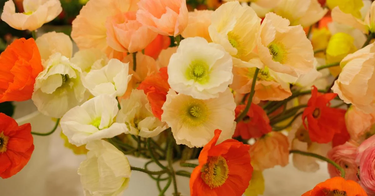
Photography: Christina Lim
In this Team Flower article, Tellie Hunt of Hunt & Gather Floral in Canada joins us for an interview chatting about her favorite design tool: color! In this interview, you’ll hear about her journey from a tattoo artist apprenticeship to owning her floral design business. She talks through the importance of color, and you’ll also hear about how to design flower arrangements in difficult color palettes. Whether you’re looking to change career paths or take that next step in your relationship with color, you’ll be inspired by this conversation.

Photography: Christine Lim
Planning: Blush & Bowties
Kelly: Tell us a little bit about how you got started on your flower journey. You were pretty young, weren’t you?
Tellie: Yeah, I started when I was 14. I was working in a fast-food restaurant, and I was a little bit tired of that. I saw an ad for a full-time, experienced designer in the newspaper. Being in high school, I decided to apply for it anyway. I went to an interview, and I had fake flowers in my hair and a floral skirt, and I got hired on the spot! So I just started going after school and then on weekends to help make small bouquets and learn the basics. That's the beginning for me.
Kelly: That's awesome. Something we talk about a lot at Team Flower is that you're never too young and you're never too old to pursue a dream. I love your story because you were quite young whenever you took that leap. What was that experience like? Tell us more.
Tellie: It's about 13 years ago now, so I don't remember a lot of the specific details, but at the time I didn't really want to be a florist—I just thought it would be better than working in fast food. I had my mind set on being a tattoo artist, so I just went in there confident and ready to work, and I got the position.
Kelly: I love that. I think even some of the people who are reading may be young or in a place where they think, "Oh, well, you all are so young." They have a philosophy that age would matter. I honestly feel that it doesn't. I love you took that leap and went for it anyway! You mentioned you were passionate about tattoo art while you were working at the flower shop. So the flower shop was just kind of a, "Let's get out of fast food; I'm going to do flowers for a little while as I'm pursuing my ultimate dream of doing art on people" for you. Tell us a little bit more about what that path looked like.

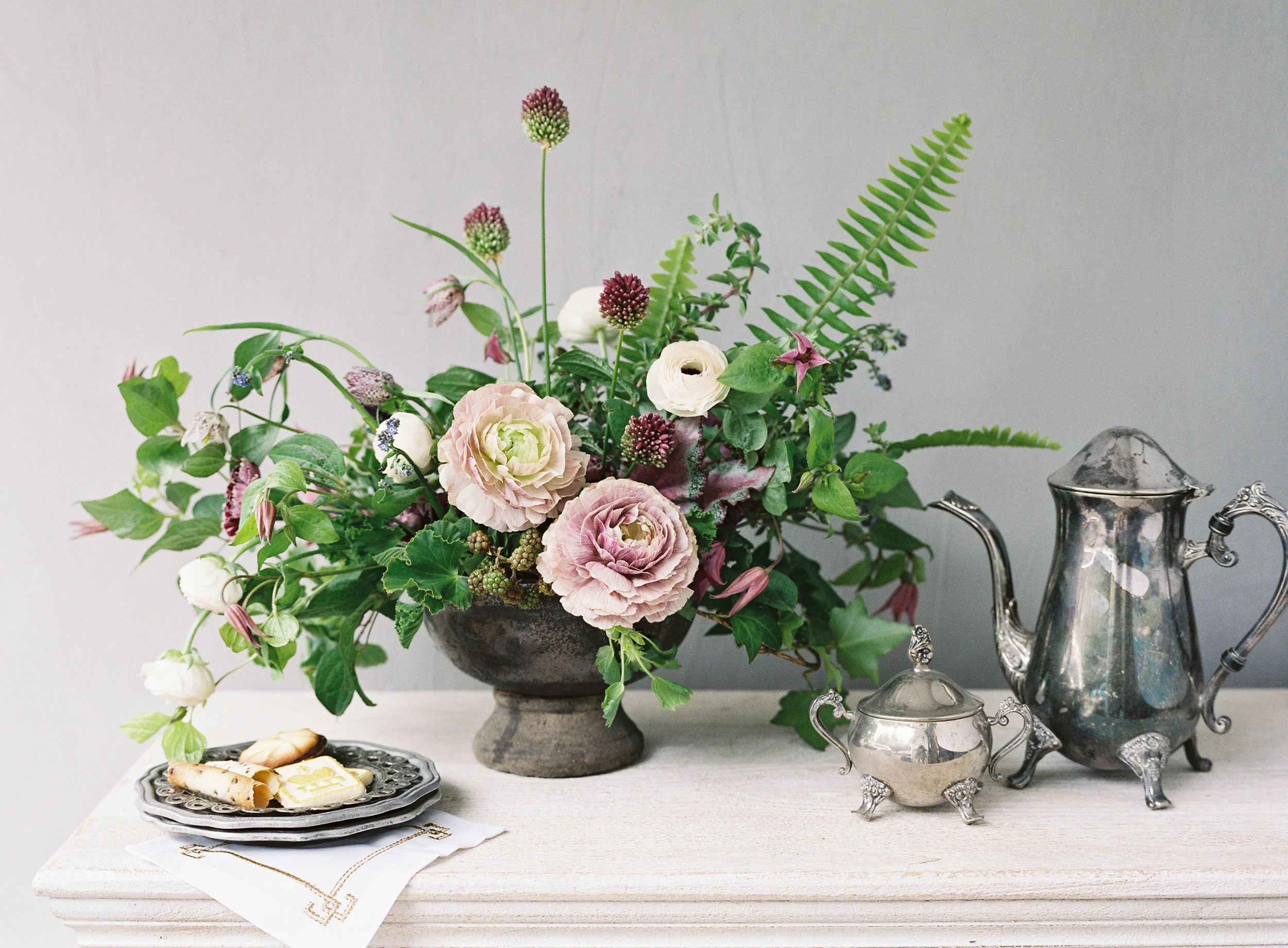
Photography: Scarlet O'Neill
Planning: Blush & Bowties
Tellie: I think from a young age, I always knew I needed to be creative and make a living. I was trying to find a career path that would allow me to do that. I never really believed in going to post-secondary, I just wanted to jump right into my career after high school. So I got my co-op when I was in grade 11, around 16. I was commuting to Toronto every day for about an hour to do my tattoo apprenticeship. They eventually offered me a full-time position over the summer. I began living in Toronto part-time on my own while completing high school and going my tattoo apprenticeship. I never actually tattooed anybody—I didn't have enough focus to kind of get to that next point. But I did learn that the industry just wasn't for me and I needed to go back to what I knew best, which was flowers. I knew I loved it, and I had a good head start in it.
Kelly: When you went back to flowers, what did that look like? Were you back to the flower shop, or what kind of jobs were you taking?
Tellie: I kept working at the tattoo shop part-time, and I think at one point I had five or six jobs at the age of 19. I was working at as many flower shops as I could, learning different design styles, trying to find out what my own niche was (because I think when you're a worker bee for other people, you adapt to their design style). It's just a way for you to figure out what direction you want to go in.
Kelly: So, what happened? It sounds like you were freelancing at several different places. Did you end up landing a place where you were at for a while, or did you go in and start your own business? What did that look like for you?

Photography: Scarlet O'Neill
Planning: Blush & Bowties
Tellie: So, I would say that I had three full-time career-changing positions. The first one was at a shop where the shop had been around for 25 years, and the owner taught a garden-inspired aesthetic based off of European gardens and Dutch-inspired design. She also trained me a lot on color combinations. I've been told quite a bit later on in my career that I have a great eye for color, and I think I have her to thank for that as well as a lot of art classes. She would sit me down and walk me through start to finish on making large-scale pieces and giving me a lot of freedom to learn. After that, I went into a shop where the owner was not a florist, and I had free reign to really work on myself and see where my design style would be going. I was at that shop for about three years running the wedding and event portion of the business and figuring out my style. After that, I finally landed a position at a flower shop that I had been admiring for years—one I'd always wanted to work at. I would literally walk by her door once a week just to pop in and give her a hug. (I'm not a hugger, so it was a big deal.) I wanted that job so bad, and I finally got it! I was there for about five years running her wedding and event portion of things. It was a great experience because I had full reign and creative freedom. I was designing in a style that was near and dear to me.
Kelly: You mentioned that you love color and that throughout this process, you were honing that skill. Let's talk a little bit more about color. Maybe you even have a tip for somebody who's wanting to get to the next step above with color.
Tellie: I think color is one of the most important things in design, especially when we work in such a visual career. So how I base color when I design is starting with one particular color. Let's say we're going to start with white. Then I want to find maybe another color that is quite different from white, so we'll choose burgundy. From white, I need to figure out how to make it go into burgundy and flow almost like an ombre effect. So I'm going to start from white and go into champagne—and from champagne, I might go into more of a dusty rose. From there I might go into a deeper mauve purple, and then work my way into burgundy. So I think it's always important that every single flower in an arrangement has a tie to another flower, and you're not receiving a palette that has high contrast. It's a lot easier on the eye, and it flows a lot better. But then again, I also like to throw in a fun pop of color that's unexpected because I think it makes things a little bit punchy and exciting. So maybe in a palette where we're going from white to burgundy with different shades of mauve, I might throw in a peach to surprise the eye and make it a little bit more lively.

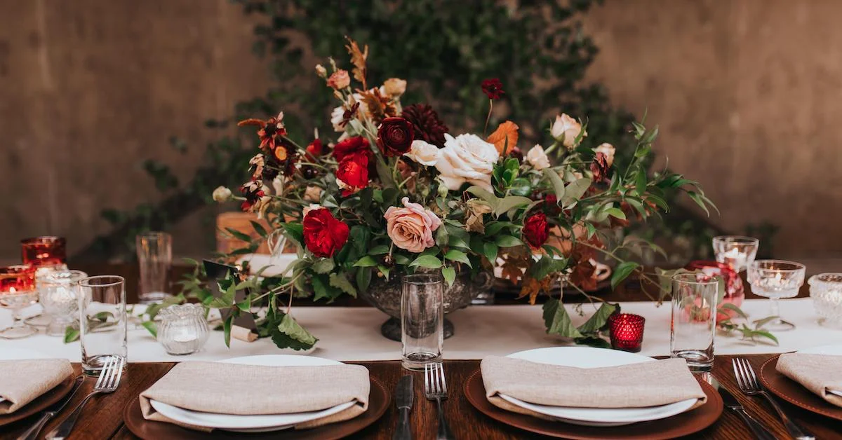
Photography: Taylor & Porter
Planning: Knot & Top
Kelly: That's a really great summary. You’ve shown us how you can use contrast, but you showed us how to build that bridge between all the pieces in a really beautiful and concise way. Thank you for that!
Tellie: Of course! I mean, it's always important to make sure that you're sticking with warmer tones if you're going to be working on a warm palette. Like in the palette I just mentioned, you're not going to add any pinks that are like bubble gum in there, because it's not going to be in the same color range.
Kelly: Yes. That's an excellent point to chat about, too, because with any flower—let's say if we go with purple—there's that purple that leans a little bit bluer, and then there's the purple that leans a little bit more on that warmer red side. Color is one of those little nuances; the arrangement can be pretty either way, but it takes your design to the next level when you can start seeing the tones that are underneath and paying attention to some of those even more detailed color nuances. Is there anything else that you might like to share about color?
Tellie: I think that's a good base for it. Study what those blue base colors are and what those red base colors are. Look at a color wheel and see what colors complement each other. And keep it simple. I think when there are too many colors involved, it's a little overwhelming, but if you have those mid tones that bridge everything together, it makes it a little bit more cohesive and peaceful.
Kelly: Tell us a little bit about how you talk about color with your clients and how you help them. If somebody comes and they have a pretty basic color palette, how you guide them through something more complex?

Photography: Purple Tree
Tellie: To be honest, at this point most of my clients come in and tell me a mood that they're going for as opposed to a color palette. So somebody might come in and say, "I'm looking for sunset tones. Or warmer, moodier tones.” They just give me more of a vibe. I don't have a lot of people coming in and saying, "I want pink and purple."
Kelly: That's really interesting. You're the first person who I've ever heard say that clients come in and do that, which is awesome because I think that that's something that just automatically turns the conversation to being a little bit more open—because a mood can be interpreted in a lot of different ways.
Tellie: Yeah, I think that if people are coming to us, they love what we do, and they can see the interesting color combinations we have. So quite often they do pick something that they've seen in my portfolio that inspires them, and we base it off of that. If there is somebody that comes in and does want something more standard—like purple and pink, for example—I'll make suggestions to bring the palette to life a little bit, and then show examples of work that I've done, which demonstrates that.
Kelly: I was going to say, "Can we talk a little bit more about purple and pink?" Because that can be a really tricky palette. But you just bridged that gap very beautifully. It just filled in in my imagination how choosing some mauve to go with that could tie it together. Let's talk about some other tricky color palettes and how we could maybe tie those together.
Tellie: I'm going to say red and white. I think it's one of the hardest palettes to do because I’m Canadian and our flag is those colors, so anytime those colors come up, I think of the flag, Santa Claus, anything like that. So I always mention throwing some champagne in there, so it's not as stark. And finding some deeper mauves that are more red-based to soften it up. I've also had some people come in that are looking for a super boho kind of feel, where there's a rainbow of colors. I'm not a bright color person at all. I tend to like things that are a little bit more subdued and muted, but I had a bride come in last year who wanted every color in the rainbow. We ended up adding some smokier colors in there, like the amnesia roses and some others like the dark brown lisianthus, which have that muted, burgundy tone to them. And it just made this palette one of my favorites! It had a lot of orange, red, purple, yellow, and hot pink. And it worked because I ended up bridging things with a bit more muted tones to soften it to the eye. And I loved it. That was one of my favorite weddings that we did last year!

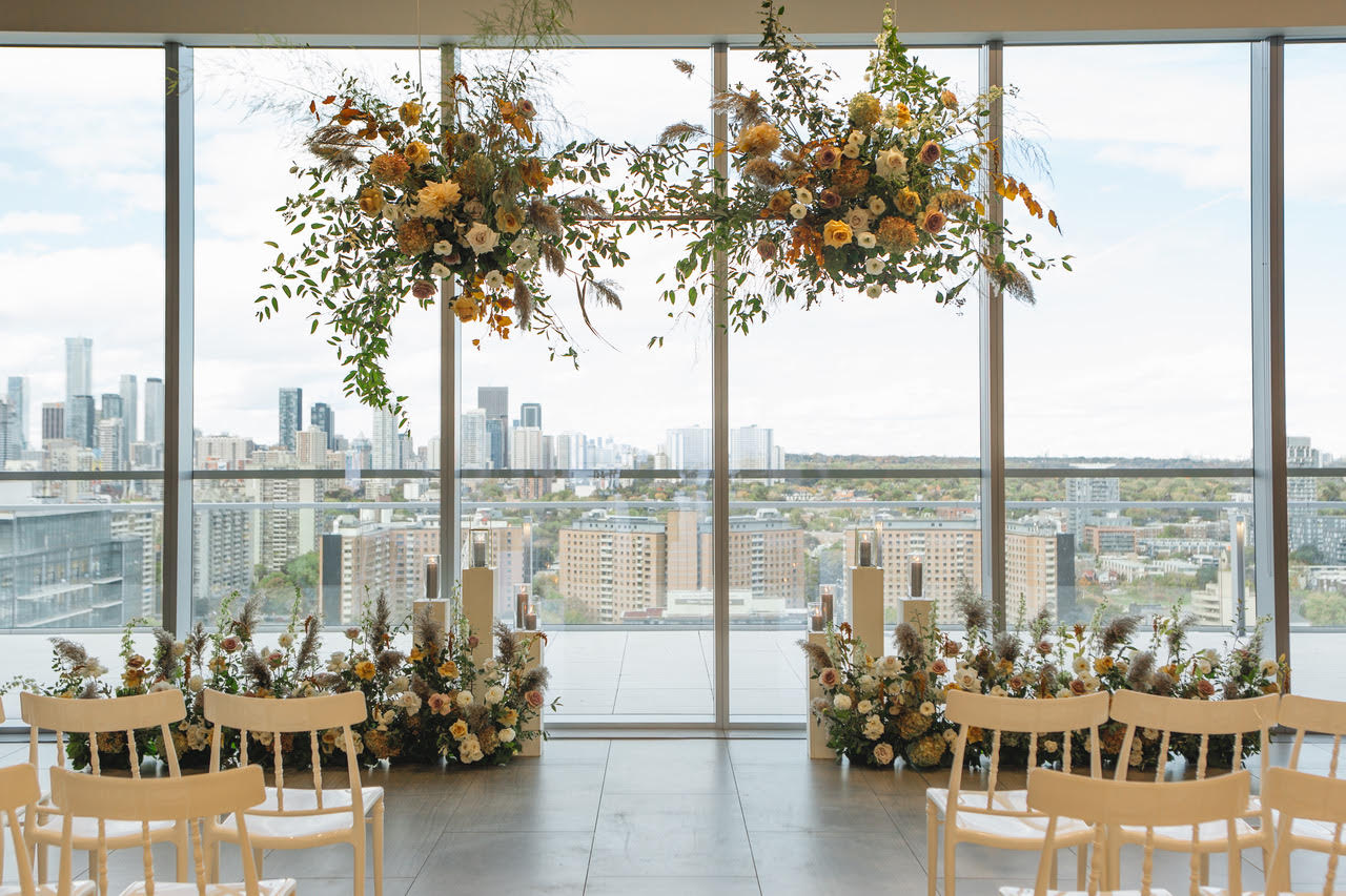
Photography: Assaf Friedman
Planning: Lexington & Co.
Kelly: That’s really cool! What about a yellow palette?
Tellie: I like yellow. I think it's fresh and citrusy. I would definitely throw some golden mustard in there, combo roses, or toffee. (Here I am, just like, "Throw muted tones in everything, and it's fine." Ha!) So adding some nice warm golden tones with the bright yellows so that it's not so in-your-face. That's just my personal opinion. I tend to like things that are subtle and peaceful when it comes to flowers. And I think when everything is too bright, it's just a little much for me.
Kelly: Yeah, everybody has completely different things that they're drawn to for various reasons. I think that even what we're drawn to can tell us a lot about ourselves, our personalities, the things that we love, and what we’re passionate about. I think that's a fun thing about different design choices and those kinds of things. But you really are, I think, an expert in this! You did a moody type of palette, where you were able to use some great colors, but bringing them down to a place where it does feel very subdued and natural. So, let's talk about five flowers you couldn't live without in your design style and color palette range that you like.
Tellie: I think it depends on the season, to be honest. I mean, obviously, roses are a staple for everyone. There are so many beautiful colors out there. Every time somebody tells me they don't like roses, I find a rose that they love. I have used quicksand in absolutely everything, as well as amnesia. Those are my two staple roses. Coco Loco, we're just starting to get here with some local farmers. We're very limited up here compared to what you get in the US because of shipping. A lot of the time, Canada can't meet the shipping quantities that the US can, so we have a bit of trouble. What else do I love? I need a lot of things that have shape and line, so I think right now I love fritillaria. It's probably my favorite spring flower. I love things that are soft and flowy as well as unique like spiraea and smoke bush.

Photography: Marisa Joan Photo
Planning: Blush & Bowties
Kelly: Smoke bush is I think really fabulous for the type of style that you do. I think it suits your style so well, both the leaves and the puffs. It's such a cool plant.
Tellie: It's a very limited season for us in terms of the smoke, but I do enjoy it while I have it. I guess to answer this question quickly, I will say I need something flowy, fluffy, and soft like spiraea or smoke bush. I need something that is a larger bloom in some muted colors like the roses I've mentioned. Also, dahlias will fall into that range, like the café au lait. I need something with line and shape like the fritillaria or foxglove. Then small airy flowers, which I would say my favorite are probably chocolate cosmos. Those little tiny guys dance and give an arrangement a little bit of dimension.
Kelly: I love those little dancers! It is hard to pick a top five, though foxglove is definitely in mine as well. Tellie, thank you so much for sharing your knowledge with us! You’re such a talented designer, and I’m so grateful you’re loving the world through flowers.