Curating Flat Lays for Social Content
In an industry built upon aesthetics, it’s no wonder flat lays are a must-have element of a floral designer’s social feed.
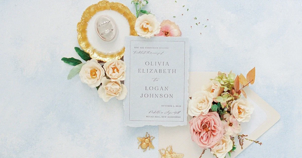
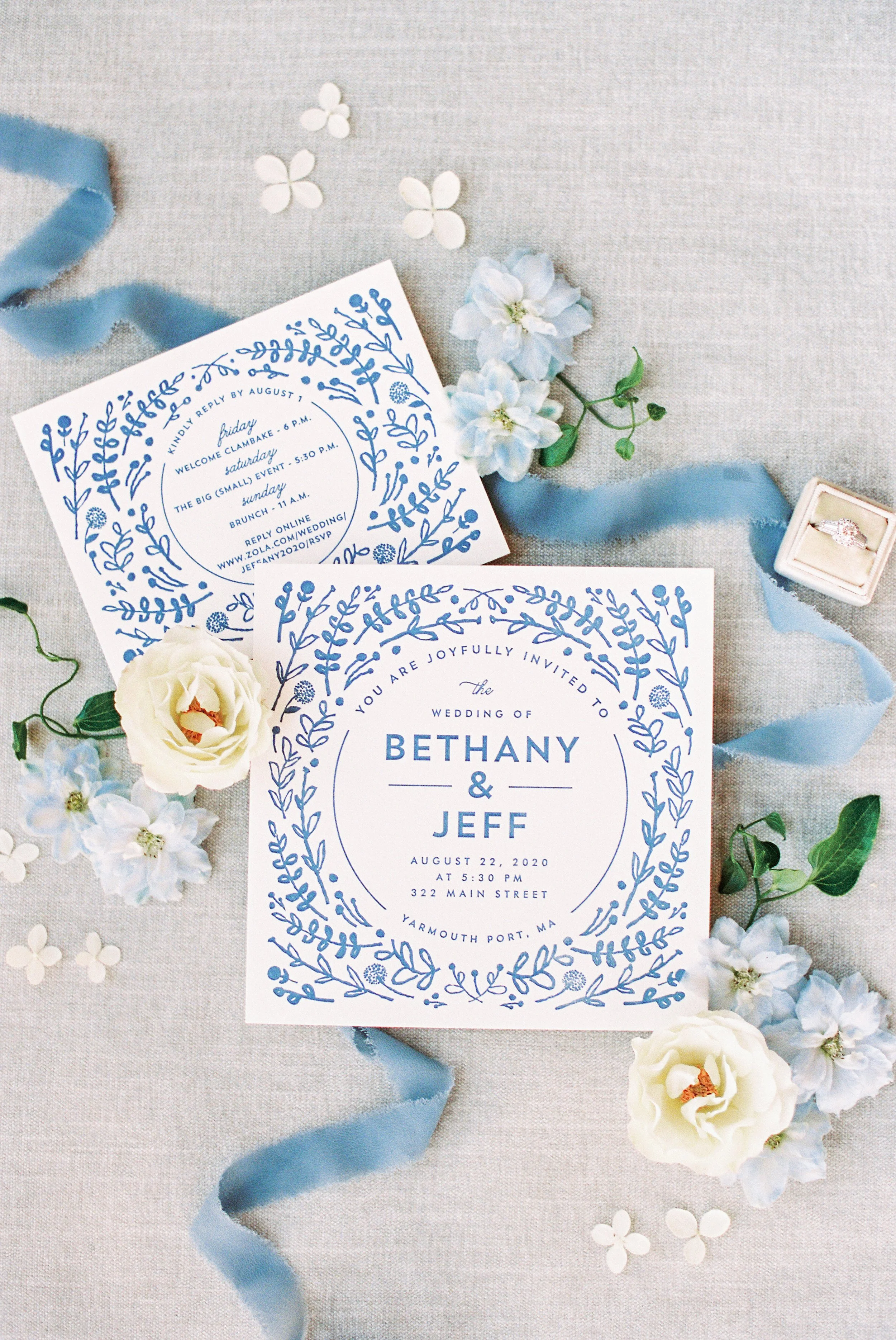
Flat lays show off new and different aspects of a florist’s work, from the work it takes behind the scenes to high-quality and sustainable practices used in the business. Additionally, they are a great way to tell a more complete story of an event by pulling in small but meaningful details to complement the event décor.
Creating a flat lay tells the same story of your brand in a different way.
Florists are known for setting the tone and ambiance for an event, bringing warmth and texture to an event’s overall design.
So naturally, beautiful blooms make for a stunning flat lay and help to tie all of the design elements together to create a breathtaking finished product for the whole event team to use and share.
However, be mindful that the quality of a flat lay matters. From how it’s curated to how it’s shot, every detail should draw in the eye and make viewers feel the essence of the event.
Here are a few tips for perfecting floral flat lays that look lovely and win over your social media audience.
Know Your Aesthetic
Defining your brand’s look and feel will help you know your preferences for how your florals will be captured.
For example, do you like a dark and moody feel to your work? Or do you prefer it to feel light and airy? Are you one to include a bit of quirk in your arrangements, just for fun?
Identifying your style will guide you in consistently selecting and styling elements for your flat lay and editing so that your floral creations always look their best.
Build a Styling Kit
As a creative, you understand the power of consistency across your social feeds and other branded materials. Building a styling kit with your favorite details to accent your flowers will elevate your flat lays to be more polished—all while also keeping your aesthetic uniform.
The props you choose to fill your styling kit will vary based on your unique style, but a few examples that I love include decorative scissors, silk ribbons, and trinket dishes.
You may have an antique hand mirror you love or an illustrated book on botany that can add interest and hint toward expertise. Stay true to your brand and how you want to present yourself on social media.
You can use all of the principles of design when preparing your flat lay.
Invest in a Styling Background
Flat lays are all about bringing together different textures, so your background can serve to let each individual element stand out.
Styling mats provide you with a clean surface free of imperfections and distractions that draw attention away from your design.
In addition, these mats ensure there are no table cracks, wrinkles, or random fabrics that don’t match your aesthetic.
There are lots of beautiful linen, velvet, and painted canvas styling mats that are made specifically for staging gorgeous flat lays, so look around until you find the right fit!
Get the Lighting Right
Even more important than the actual details is the lighting you capture them in.
Creating scenes in mixed lighting leads to muddy-looking images. To get clean, crisp shots that look great on social media, it’s best to create your flat lay scenes during the day when you can use soft, indirect sunlight as your only light source.
Turn off all the lights and set up next to a window just beyond the direct rays of the sun. You’ll also want a reflector to mitigate the shadows. A white towel, pillow, or foam board can be an affordable and effective reflector.
Set your reflector up directly across from the window to bounce light back onto the flat lay and soften shadows.
For more tips and techniques to make your floral business marketing shine, check out our How to Photograph Flowers online course.
Keep it Simple and Polished
Ultimately, simplicity is best in styling. Too many props and pieces in a single image will feel cluttered and busy.
Avoid crowding the shot with details, and instead, think about leaving space for the eye to rest. Start by styling the scene with all the pieces you think you want to use.
Then, step back and choose one thing to take away. I usually find that my strongest designs come out after I’ve removed two or three props.
Get Comfortable with Editing
You don’t have to be a professional photographer to learn how to edit your photos!
There are some powerful editing tools for your smartphone that make it easy and efficient to adjust your images to fit in with your brand. I love using VSCO, which allows you to adjust exposure, temperature, tint, contrast, and more.
It also offers some great filters to add a finishing touch to your shot, but I recommend toning down the intensity of any filter you use. I’ve found 30–35% strength tends to be a sweet spot for beautiful consistency throughout your photos.
A lot of work goes into your brand, your arrangements, and your business, so you should have images that reflect your hard work!
When you put all of these tricks into action, you’ll start producing the eye-catching flat lays that showcase your brand, demonstrate your expertise, attract new followers, and draw in leads.
You’ve already got the creative eye, and now you have the technical guidance you need to bring your vision to life.
Photography Credit: Lynne Reznick Photography

