How to Approach Color in Floral Design: 5 Brilliant Tips
Olivia Strohm Photography
If we're honest, we used to be pretty intimidated by color. It can be so hard to work with color, especially highly contrasting colors. When designing with these types of colors together, such as yellow and purple, it can be hard not to make the designs seem kitschy or too "holiday." Color can quickly cross the line between creative and fun to cheesy and mediocre very fast.
So in an effort to make designing with color easier, we decided to play with it more and see what decisions we could make to elevate our designs. When you’re wondering on how to approach color in floral design, here are five tips you can go to!
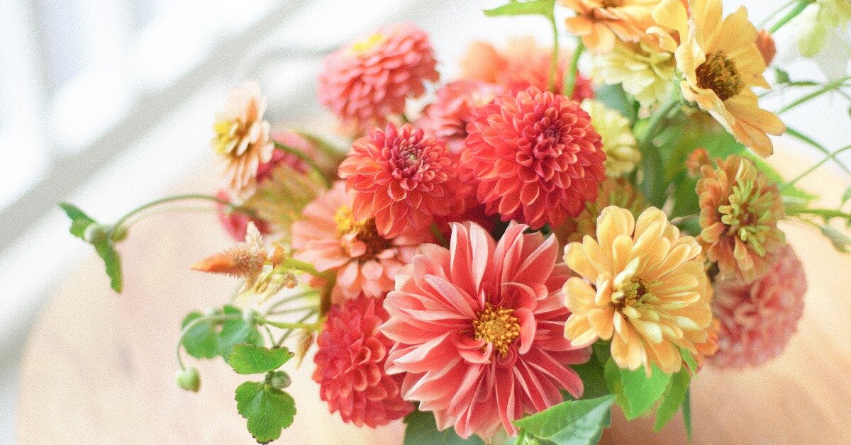
1. Don't take it too literally
When designing florals for a wedding, don't take the wedding colors too literally. If the wedding colors are blue, yellow, and blush, don't do yellow, blue, and blush flowers! Think about the in-between tones or a palette that would compliment these colors (and be mindful of things like table linen colors, dress colors, and other details). Maybe don't bring in the blue at all, or perhaps do a pop of it on the side to accent.

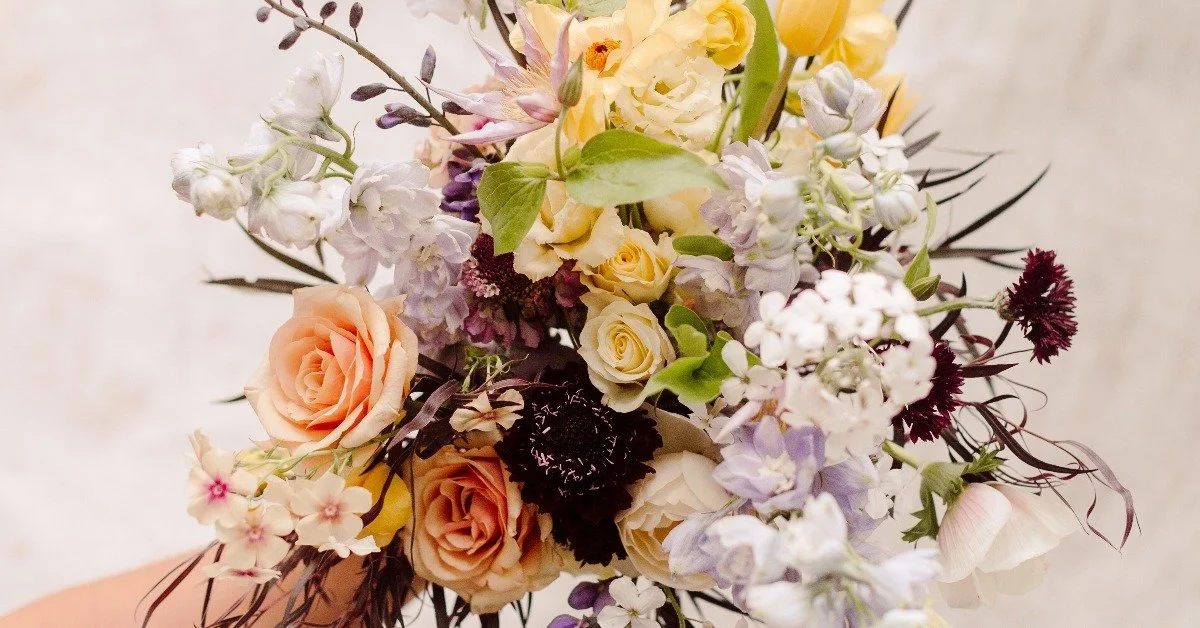
Andie Avery Photography
2. Color block
Color-blocking is an excellent way to incorporate colors that are very different without making the design seem too polka dot. Keeping shades together will also prevent the design from appearing too holiday-like (in the way a red, white, and green arrangement can look very much like Christmas if you aren't careful about color-blocking and blending). This brings us to our next important tip…
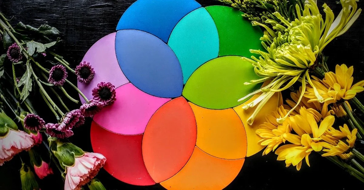
3. Blend!
Blending is probably one of the most important things you can think about when it comes to colors. Using shades and tones of the same color to bring it into another color more seamlessly helps the eye move across the arrangement without stopping. This is important for the viewer to experience when they are looking at a design. It's more pleasing to the eye when there are no harsh stops. Color blending and depth are the two main ways to do this.

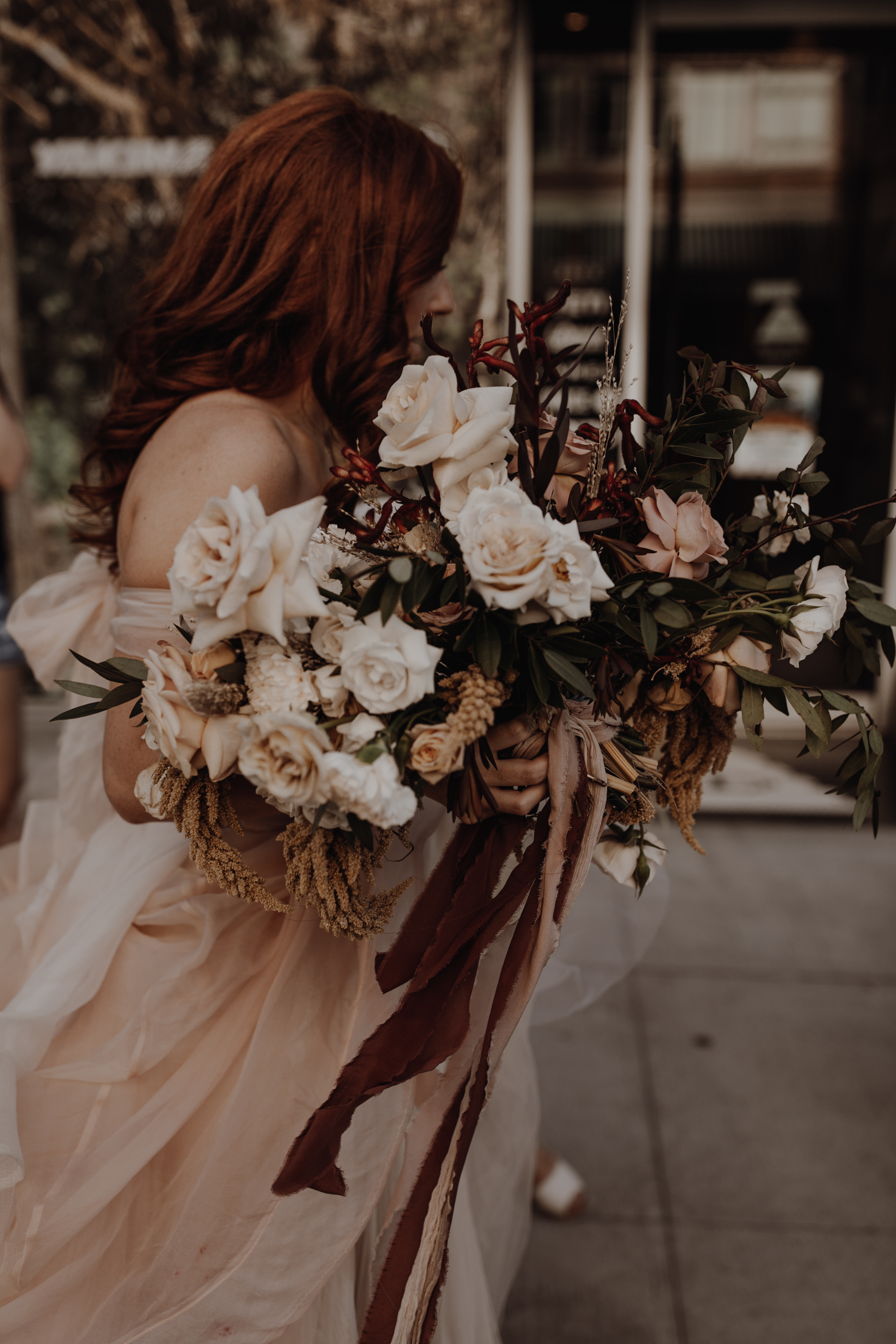
Peyton Byford Photography
4. Pay attention to the little things
When blending, it doesn't have to be the whole flower or texture piece that serves as the blending tone. It can be as small as the tips of the greenery slightly turning into an autumn red or the inside of a White Majolica spray rose that brings out the gold to blend to a buttery yellow tone that brings it to a bright yellow hue. These little details, however small, will be noticed (even unconsciously) by the people who look at it.
5. Lastly, think about the temperature of the colors
It might be weird to think about colors this way, but there are warm-toned colors and cool-toned colors. Warm tones have hints of yellow, orange, pinks, or reds in them. There are warm-toned blues or grays. Cool tones have hints of blues, silvers or greens. Similarly, there can be cool-toned purples or warm-toned purples. When designing with color, it's usually best to keep these tones together and not mix them (although there are times when this rule could be broken). It can look a little disjointed to use a cool-toned purple with a warm-toned pink. The times when we do like to mix warm and cool tones is with a very monochromatic color scheme.
Thank you for hanging out with us to talk about color for a bit! We hope you're inspired to use it more often and play with different combos in your design style.