How to Use Tricky Colours in Floral Design (Even the Ones You Dislike!)

Do you have one colour you just won’t (or can’t bear to) use in your floral designs?
Florists can often have that one colour they won't use, and it becomes easy to rely on the tried and tested base colours. Part of the beauty of colour is that it can lead your designs, helping to produce similar arrangements that build up your style. But what if you're ready for a change?
What if your bride wants a colour you don't like to use or a colour theme is needed for an event? Maybe you want to take your floral designs in a new direction to reach a new audience. To try and help you overcome your colour gremlins, let's take a closer look at some common techniques that can be used to break them down and help open up your palette.
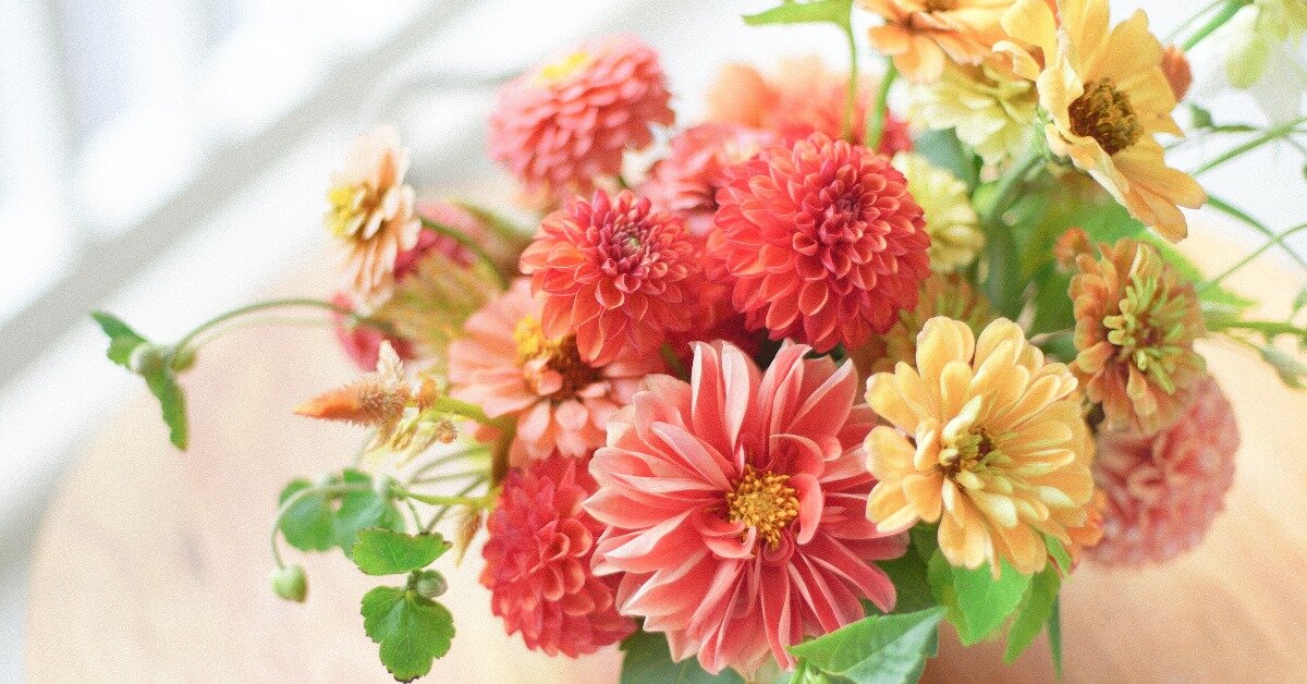
There are many “problem colours,” and different people have different shades they don't like—so to kick things off, I'm going to start with my own archnemesis: yellow. Yellow is the colour of primroses, daffodils, and sunflowers. In general, it's not a colour you would find in my house, it's not one I wear, nor a paint I would pick, yet it is a leading hue for spring—the first big pop that comes after winter. It took me a long time to use yellow (even using a colour wheel didn't really help), so how did I get past it?

Using Tone and Shade in Floral Design
I took a step back and began to look at tones and shades—softer tones of yellow or darker shades of ochre and mustard. I learnt that by using flowers with more delicate tones, it could help the yellow recede and blend. It also allows you to graduate your colours upward, bringing more of the yellow to the forefront. Your strongest yellow doesn't have to be a full flower; it could be the centre of a larger flower. An iris is the perfect example of this, with the intense yellow naturally placed within an equally strong purple.
So if yellow is also your nemesis, look out for flowers that can help you build up from very light tones or look for shades of it in your focal flower. Throughout your arrangement, build up to your most robust yellow colour, and graduate your colours to build up your swansong flower.

Using Shape and Texture in Your Flower Arrangements
Next is pink, and for me no specific dislike of a tone, it could be the baby pink of a gerbera, the fuchsia pink of a sweet pea, or something in between.
I personally have found pink to be a bit of an assault on my eyes, always drawing attention away from the other flowers, which were more detailed regardless of the type of flower. To work around this (as so many people love and request pink), I took to looking at the texture and shape.
A pink spire of larkspur was far more adaptable and less showy than a daisy-style flower bursting from the centre. Spires don't have to be tall in an arrangement. The tips can be just as effective to acquire shape and break the solidity of a flower. If you do need much more rounded coverage in your arrangement, texture is another way to go. Try to pick pink flowers with thin layers or ruffles or a visible texture to the petals such as ranunculus or an Icelandic poppy. Texture and shape, even on a strong-coloured pink flower, can break the overwhelming power of that colour without weakening the overall effect.
Look To Foliage
Don't forget to look at foliage! There are some beautiful pink shades of phormium giving sharper lines for contemporary arrangements, or heuchera leaves with soft pink wavy edges. Another way of using texture and shape to inject pink in a soft, noticeable manner.

Look for Negative Space for Your Floral Designs
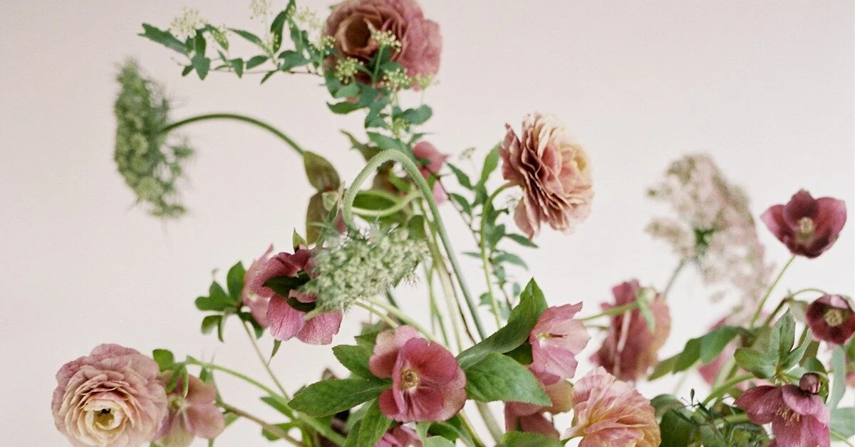
Red is next—it’s always a colour associated with valentines, a hue that is always strong, always bold. It can scream for attention like pink, but it tends not to be as shouty, just very strong.
Red was a real challenge for me, as I do like the colour. However, I found it hard to work with within floral arrangements. This is one colour where the use of a colour wheel really helps; red’s opposing colour is green, and yellow-green is a split complementary to green—so not suitable directly to red. So you can use space or filling of space to blend and encourage colour association almost like a buffer.
Confused? It can help to look at nature. My breakthrough came when I started using seasonal flowers from my garden and local growers, when I could see reds within the different tones of greens in the garden (a little geum called 'Mrs. Bradshaw,' now being one of my favourite summertime accents!). Examine the different garden greens. By using the green that is complementary to red, you can move to yellow-green, then put in red-violet, which is a complementary colour to red. So that space in between your flower choice is incredibly important, almost like the background colour to a photoshoot.
For more contemporary floral styles
Not filling that negative space and using the natural line of the flower elevates the red colour and separates it from its fellow flowers. The space stops the clash, gives a break similar to that of the green changes, and it allows the eye to take in the one colour in isolation while maintaining the relationship to the colour. I often use a red geum in a similar way to I would a chocolate cosmos.

Colour Blending: Looking to Nature
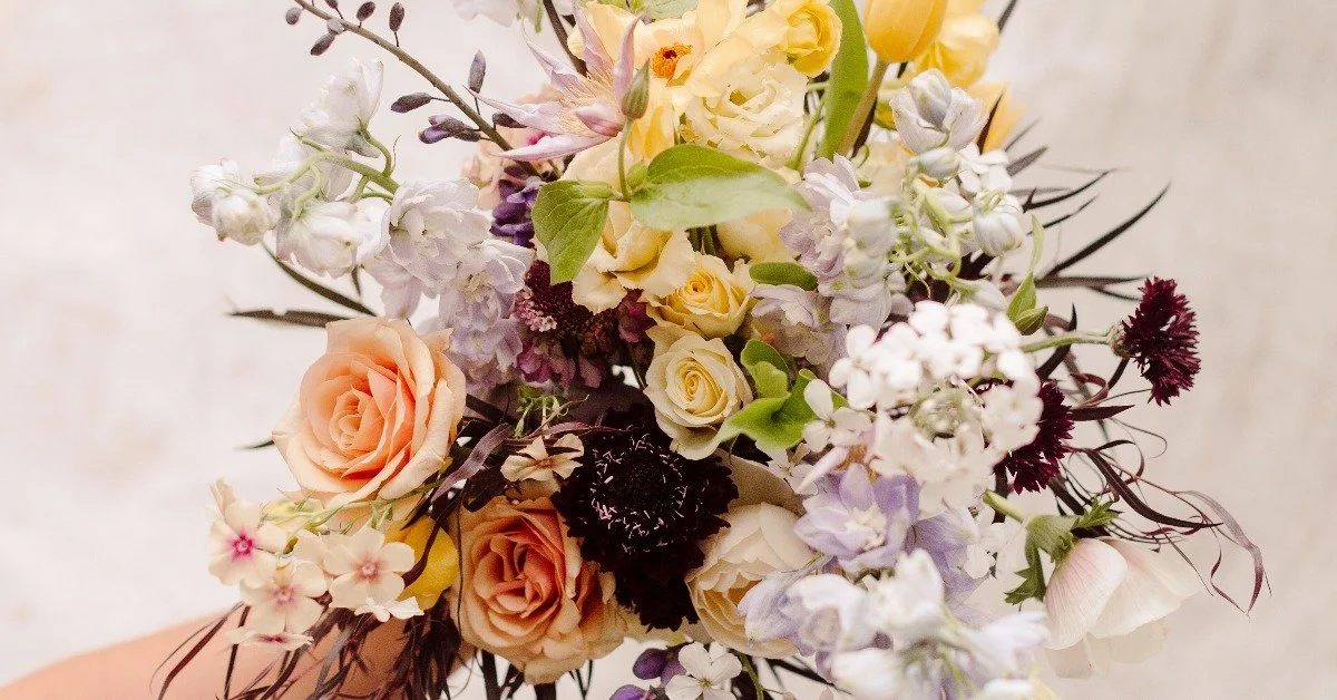
And finally lime green, a colour I at first found acidic, but now I can't do without. In spring, it can be the colours of hellebores. In summer, it's very much foliage. In late autumn, it comes into its own with froggy and spider chrysanthemums.
The key with lime green is not to look at it on its own in isolation, but rather, use it as a contrast to your focal flowers or as a complementary to your darker green foliages, helping to run through an arrangement and set a background. A traditional Christmas wreath is a great way to practise working on blending greens as a background, allowing you to make a base, then select colours to suit where the separate foliages lay next to each other. Earthy browns are the hues naturally complementary to green, so these can be used to help create shape and line, such as a pine cone to give texture and shape.
Whatever the colour is that you struggle with (or if a client asks you for a colour you really don't get along with), try to remember the following:
Tone and shade
Shape and texture
Space around or in between
Colour graduation and blending
I'd also add that it's also worth trying to put the colour into the vessel, as this can set a mood. The more you try, the more you'll get used to how the colour can be utilized, and you don't have to make that hue wholly central, just nod or lead the eye to it.
Even tricky colours can be powerful when used in the right way!