Diving into the Flower Color Wheel
What flowers go with what?
Tell me if this rings a bell: You’ve collected the prettiest blooms, but when you start putting them together… something isn’t quite working. Or you have a floral design client who wants specific colors, and the bouquet turns out garishly bright or boring and flat.
I’ve been there, and thank goodness, help is available! Enter the flower color wheel.
In this article, you’ll learn two methods to create gorgeous flower color palettes and two ways to put them into practice.
Color is one of the most important aspects of floral design, and you can totally learn how to use it like a pro. Dive into these strategies that will help you plan your flower color schemes in advance, guide your process as you build, or rescue a bouquet run amok.

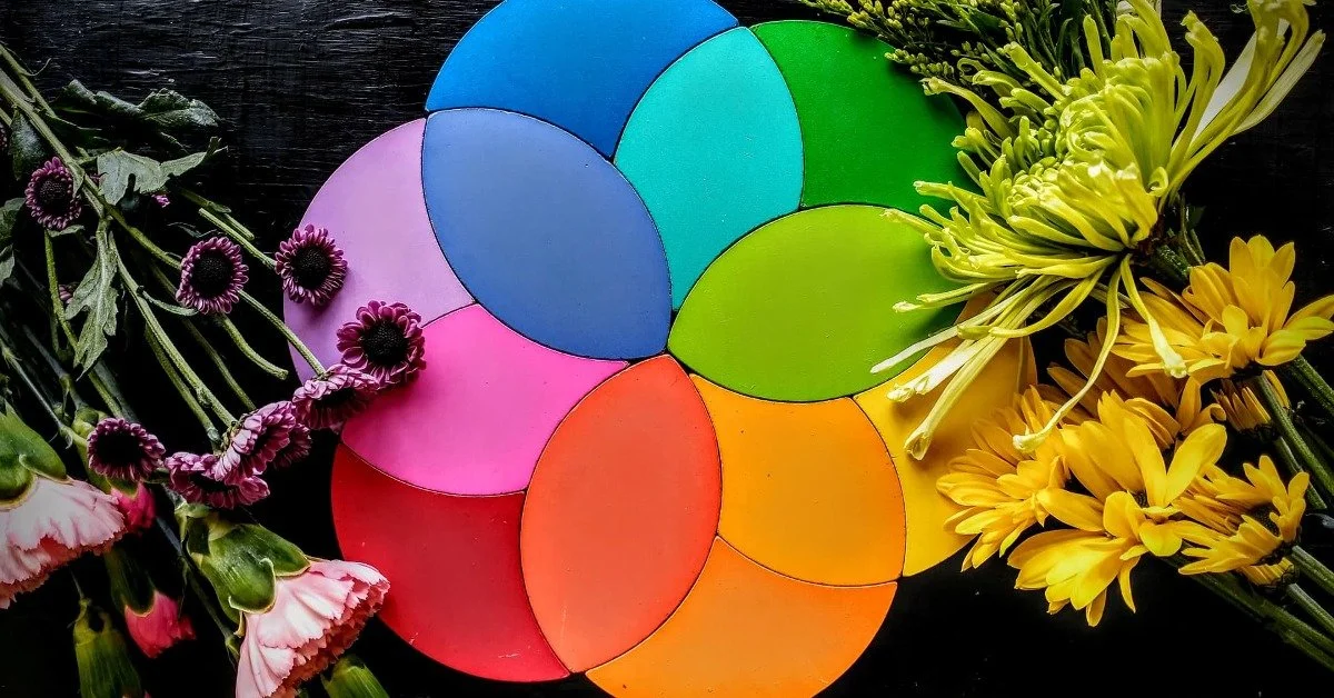
What are the best bouquet color combinations? A flower color wheel can help!
First, let’s take a quick dive into color theory. If you are the sort who appreciates a technical approach and few rules, the color wheel is your best friend! You might consider keeping an actual color wheel in your studio for reference.
Generally speaking, hues next to each other on the wheel (analogous colors) will create a soothing effect. Tones opposite each other on the wheel (complementary colors) will bring out each other’s vibrance.
You can create even more complex color schemes by combining split-complementary colors (a color plus the two tones adjacent to its complement), such as magenta, green, and yellow.
Triadic colors also work well (any three equidistant colors, such as red, orange, and yellow). Check out some great examples and more in-depth descriptions here and here.
Ready to dive in? Learn the Principles and Elements of Floral Design in our professionally developed online class.
Value, saturation, and temperature
As you explore relationships between hues, you can also play with a color’s value (lightness or darkness) and saturation (muted or rich). See more here.
If you know you have a harmonious color combination, but the arrangement looks flat, try varying the value to add depth. If you know the colors work together, but your bouquet looks like a sports team advertisement, add some muted versions of the same tones to soften the effect.
Finally, many florists agree there is one color concept to rule them all: temperature. This refers to whether a particular hue leans “cool” (with blue undertones) or “warm” (with red undertones).
Every hue found in nature, even primary tones like red, blue, and yellow, will lean warm or cool. Although the difference is subtle, it can make or break the harmony of an arrangement.
If you’ve followed the color wheel guidelines and something still feels off, likely it’s a problem with color temperature. So, unless you are experimenting on purpose, sticking to all warm tones or all cool tones will yield a more pleasing result.
Don’t worry if you don’t have a perfect eye for temperature yet, but keep practicing. You can even hone your skills with fun color games and apps in your off-hours.
How to combine flower colors nature’s way
The color wheel is a powerful tool, but you can take a gentler approach if it feels too technical or imposing.
Many florists enjoy “foraging” for the color combinations that already exist within flowers.
Here’s how it works:
Choose a focal flower and study it to see what other hues and tones it contains. Examine its petals, throat, center, veins, stems, and leaves. Now choose other plants with those tones.
Notice whether warm or cool tones dominate. Be sure all other flowers and greenery adhere to that palette too. Color temperature trumps all!
Build a “bridge” between tones. You can layer in analogous colors, lighter and darker values, and muted or more saturated tones.
You can see the process at work in this Team Flower video and this one too!
Now, strengthen your eye for the best flower color combos.
Selecting effective color combinations is a skill that anyone can learn and improve through practice. But as with any skill, it helps to start simple, master some basics, and gradually incorporate more complexity.
Experienced designers often encourage beginners to start building bouquets with a single hue. The monochromatic scheme allows you to play with saturation, value, and plant textures. It will also help you recognize color temperature.
From there, you might branch out to two main tones. Analogous colors are naturally harmonious and not much more challenging to combine than monochromatic tones. Complementary colors are more complicated but will give you excellent practice bridging.
Finally, master the art of three or more tones. Try out some split-complementary colors and triadic combinations. If you’re really feeling saucy, there are even tetradic combinations (four tones equidistant on the color wheel). The more hues you incorporate, the harder it is for the eye to rest, but they can be done well.
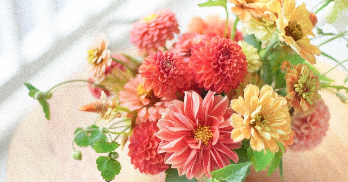
example of a monochromatic bouquet with varying textures
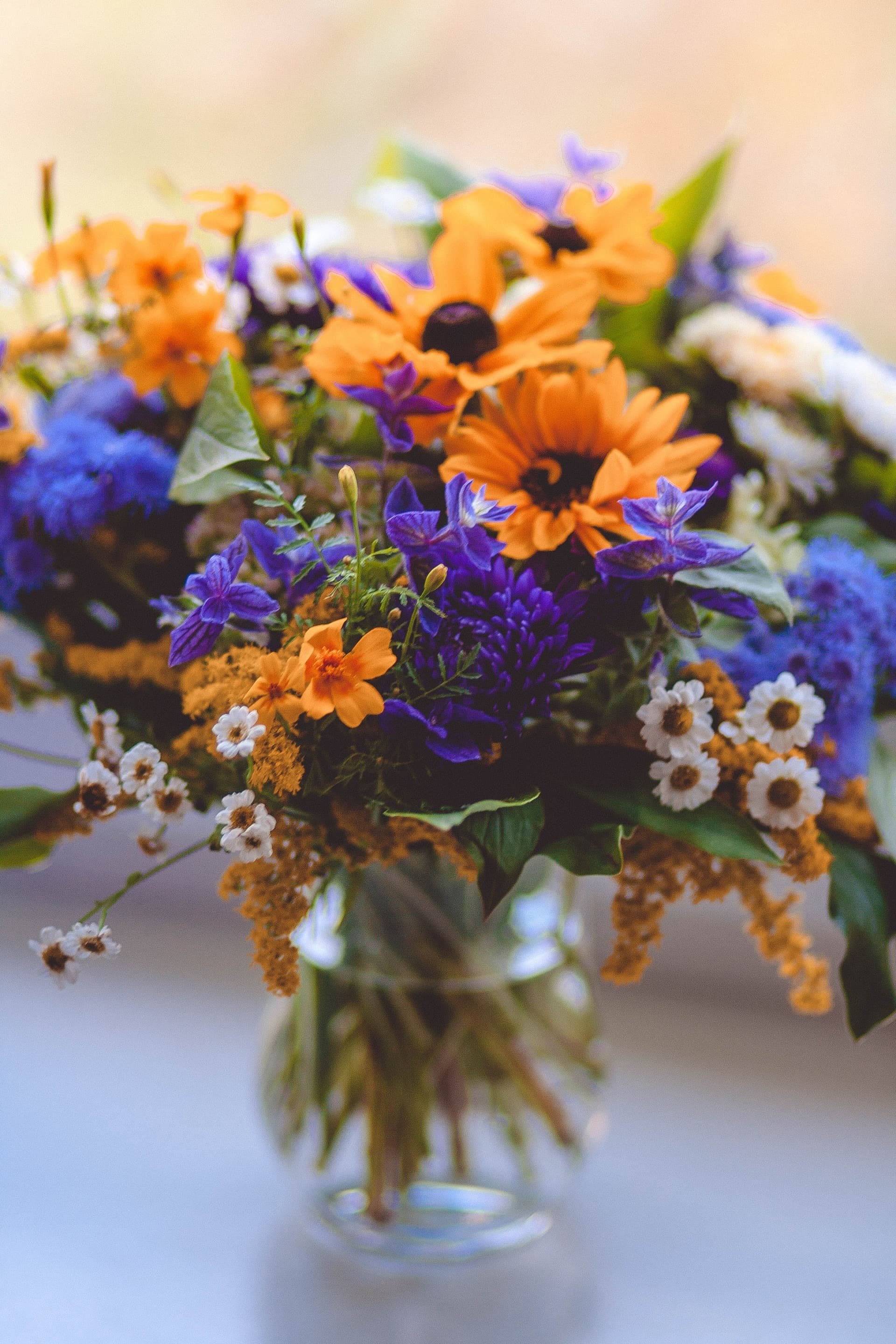
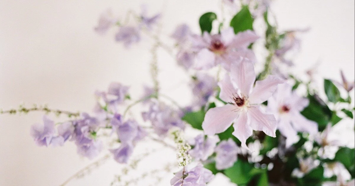
Yellow and blue are analogous colors

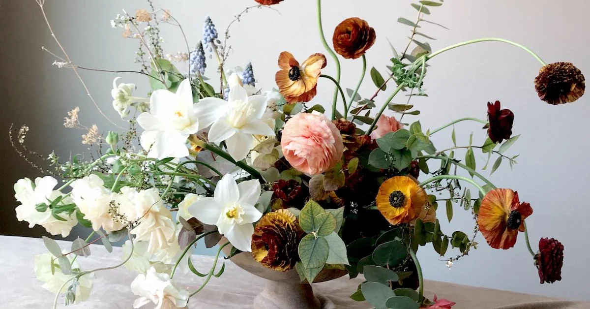
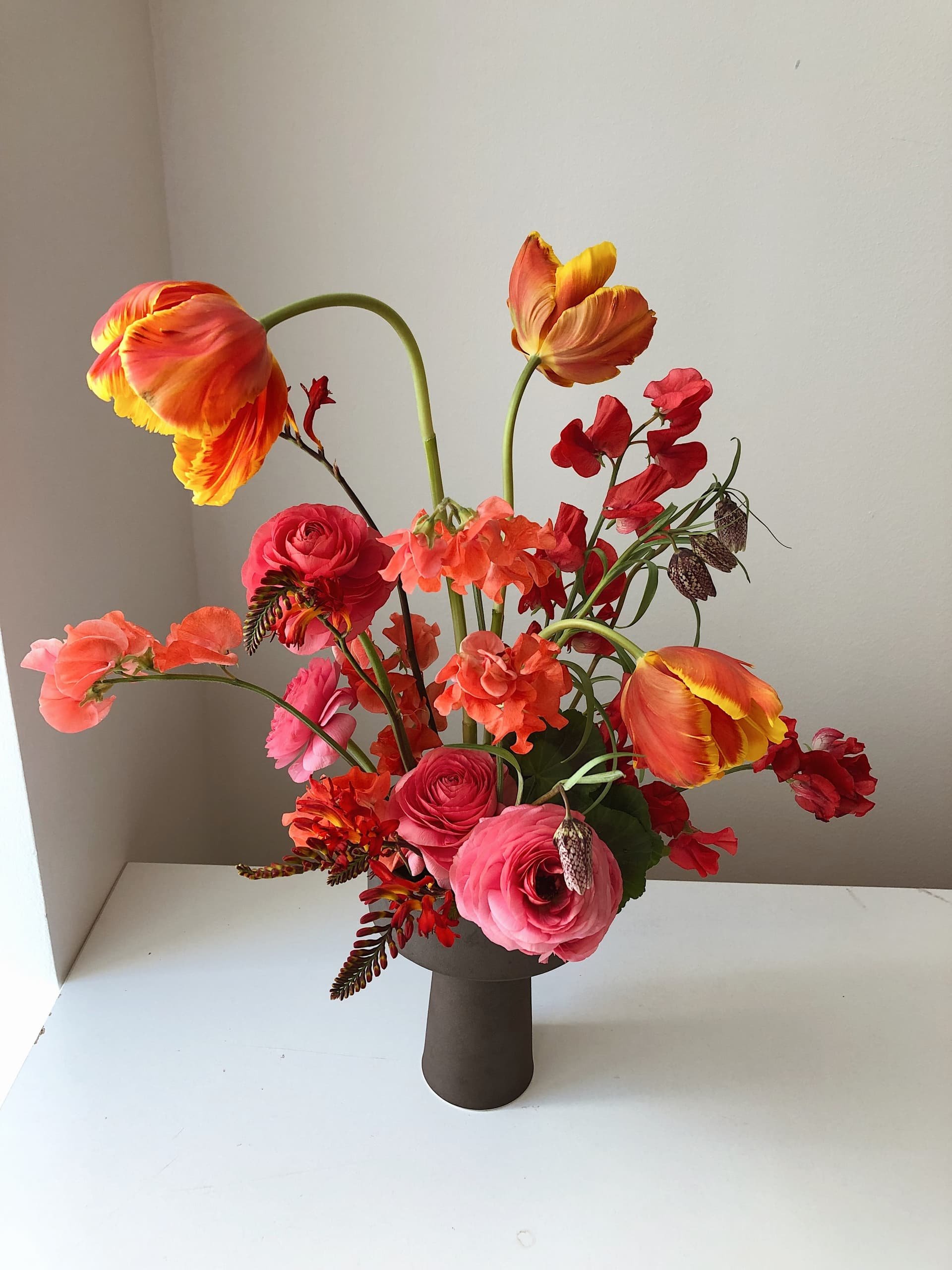
Mastering three or more colors in one bouquet is a feat and only takes some practice!
Of course, you are the boss in your studio, and you are free to experiment however you like. Still, it is worthwhile to occasionally take yourself through the process of working with a single tone—and then two, then three, or more. It will shake up your routine, teach you discipline, and stretch you outside your comfort zone.
For a quicker option, you might consider this genius idea. Instead of building whole arrangements, photograph leftover floral bits in sample color palettes. Not only can these collages help you practice layering in different tones (for free!), but the photos can be super helpful references for clients.
How to choose flower colors to fit a vibe
Although some clients may come to you with colors already in mind, many people have a much stronger idea about the emotion they want to convey.
Of course, color preferences are intensely personal, and every client is different. You may wish to create your own set of guidelines for translating emotion into colors (or jump down the rabbit hole and Google “color palettes for moods”).
But in case it’s helpful, here’s an approach that has worked for me:
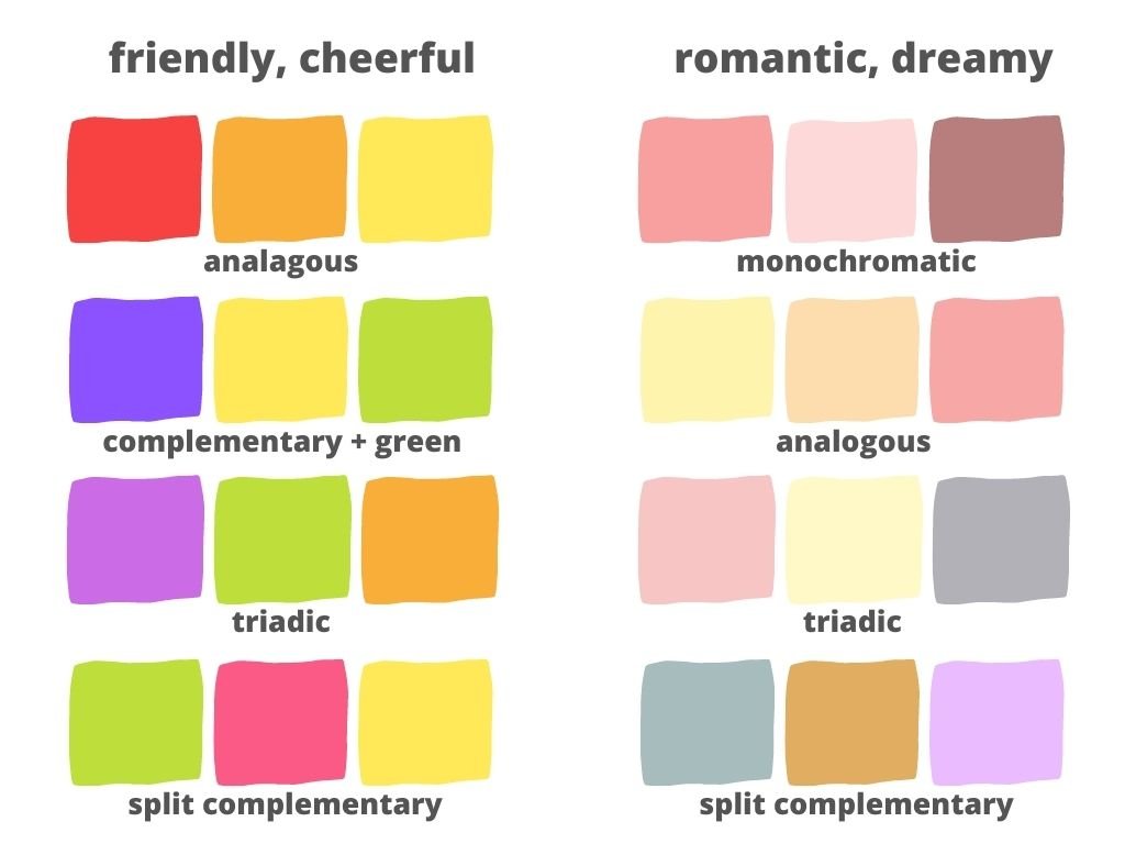
Friendly, cheerful, happy, fresh, energetic, playful: This mood welcomes more saturated tones, often combined with complementary or triadic colors. White, cream and paler accents help keep things light.
Romantic, dreamy, nostalgic, vintage, calm, soothing, beachy: A favorite for weddings, this palette is more muted. It often favors paler tones, although dark tones can work well too. Usually, it will focus on just one or maybe two hues, plus lots of “neutral” tones like cream, beige, and soft green.
Exotic, dramatic, vibrant, lush: This vibe incorporates saturated tones, primary colors, complementary and triadic combinations, and lots of green. Bold, sculptural foliage adds a ton to the mood.
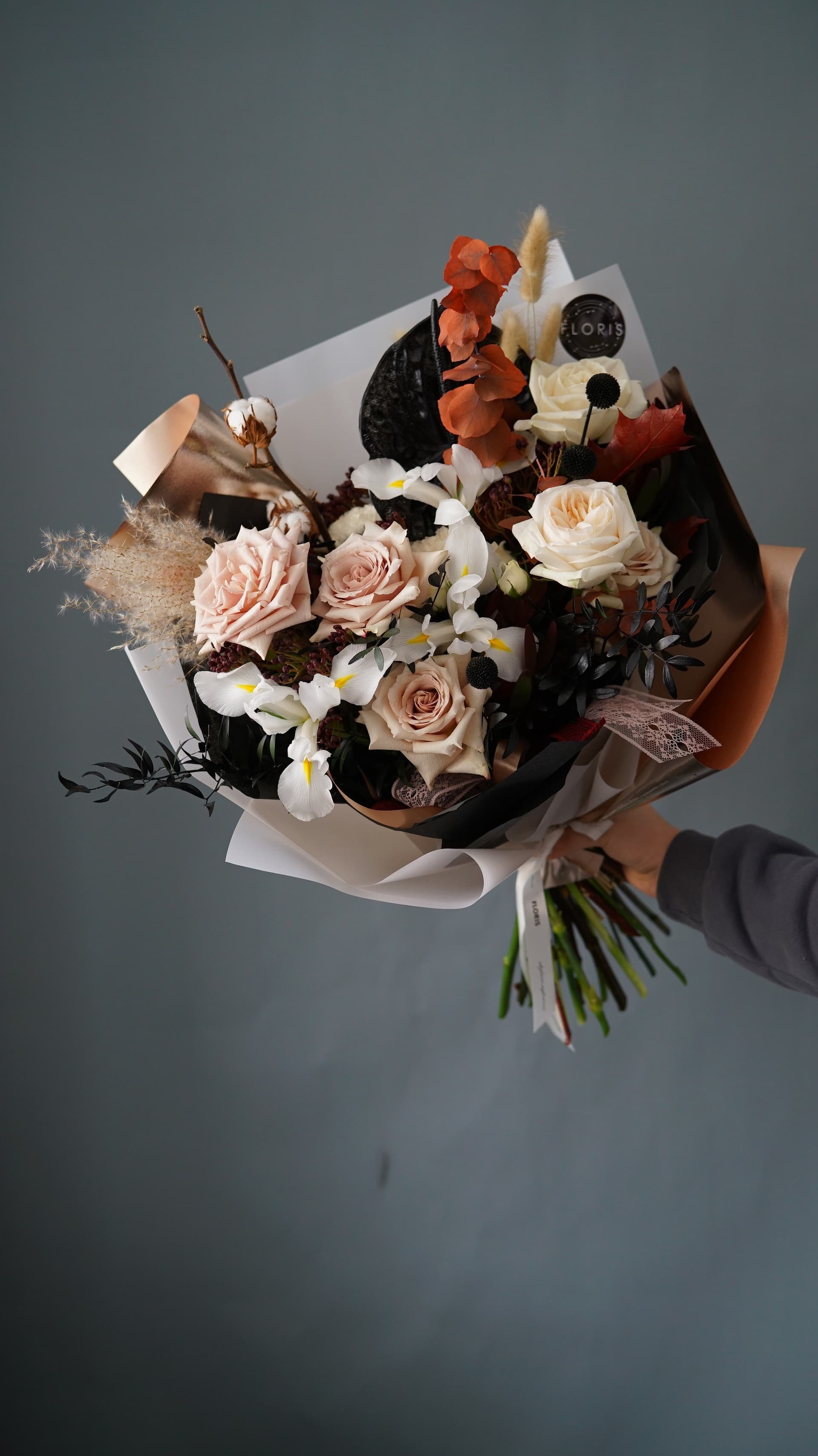
Luxurious, rich, sumptuous, sophisticated, moody: For this one, bring in jewel tones, darker saturated values, and sculptural textures… and bonus points for a statement vessel!

Keep Questing for Color
As you’re searching out the flower color combinations that make your soul sing, remember that it’s a journey.
Keep your eyes open for inspiration wherever it may strike, and keep practicing. Keep reading too! For a discussion about color bridging, color temperature, and color vibes, check out this Team Flower interview with Tellie Hunt.
If you’re ready to take the next step, the Team Flower Principles and Elements of Design online course teaches you to confidently create meaningful floral arrangements using advanced design principles and find your unique style—including powerful plays with color and shape.
And if you love books, you’ll want a place for these (and probably lots more!) on your shelves:
Flower School: A Practical Guide to the Art of Flower Arranging by Calvert Crary, 2020.
Floret Farm’s A Year in Flowers, by Erin Benzakein, 2020.
The Flower Workshop by Ariella Chezar, 2016.